
Friday, 8 May 2015

Planning- Print Templates
Magazine Templates
As a part of the planning stages, I created templates for my magazine front cover and film poster. This was done in order to understand what appeals to our target demographic. Before doing the final construction of the magazine, I created three templates and presented it to a focus group and collected feed back.
I researched about several different horror magazines such as 'Fangoria', 'Little White Lies', before picking one that my film would feature on/ use as a template. I came across a horror magazine publication called 'Rue Morgue'. This particular magazine is dedicated to deliver horror within culture as well as entertainment, therefore it caught my eye since the audience for this publication are die hard horror fanatics, and would probably have an open mind with discovering new independent films of the horror genre. The magazine is also aimed at a niche audience and generally feature low budget films than big blockbusters which would be quintessential for my British independent film.


 Here are my three templates:
We gathered a group with a mixture of ages, from as young as 15 to as old as 22 years old, we had equal amounts of females and males so there wasn't any biased opinions on the templates. By presenting the templates to the group helped us get a rough idea on what our target demographic preferred. Each template stuck to the same masthead and the same colour scheme in order to strengthen and keep a persistent brand identity.
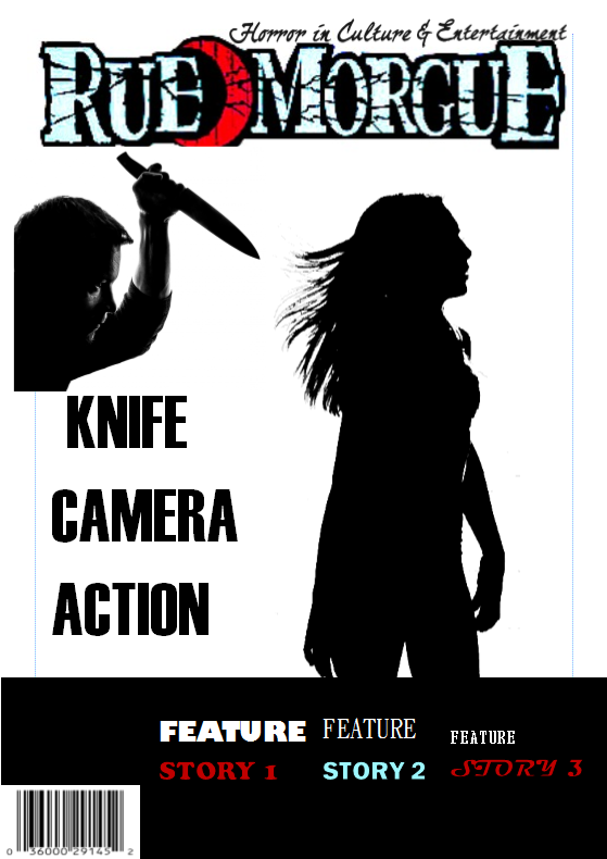 The first template was the least favorable out of the three since the main image only conveys a little narrative. By only having the weapons displayed on the front cover and not other characters such as the killer or final girl, does not give the audience an idea of what the film could be about especially when my film is an independent film trying to reach other audiences, the focus group said the image does not entice or intrigue them since it is quite 'plain' additionally 'Rue Morgue is known for its extravagant covers that are sometimes illustrated or gruesome, because of this my main image in this template does not fit the publication that I have chosen.
The second template was very well liked, compared to the other two. This was due to the main image conveying the intense murders and built up tension that is generally conveyed in slasher films. The main image shows the killer about to attack a victim of his killing spree, though the image shows her glancing away, not noticing that she is about to fall to her death. This image creates dramatic irony since the audience can see the killer yet the victim does not. Also the placement of the feature stories was constructive, the feature stories were placed on the bottom of the page since it gave more of the focus on the cover feature which consisted of a bold and very noticeable typography of the independent featured film therefore forcing the audience to discover and find out about this particular film.
 The third template was also liked, but not as much as the second template. The main image was liked since the 'camera' is very symbolic to our film though some of our focus group mentioned that the main image does not convey the horror/slasher genre and is not as gripping as the second template however having the camera cover the face of who is holding it (the killer) does convey some sort of mystery. The positioning of the title was also favorable as it was very noticeable and eye catching however the feature stories were placed in an unconventional manner to how 'Rue Morgue' magazines are presented and it took the focus off the main feature story, what was also said was that the feature stories made the front cover look clustered.
Since the second template was the favorable one, I am going to try and stick to the template when constructing my final magazine cover as it appeals to my target demographic the most.
Film Poster Templates
For my film poster, I did the same technique as I did with my magazine cover. Which was to present templates, to my focus group and collect feedback. These are the three different templates I have composed. The film poster was different to my magazine in terms of brand identity. As a group we decided to have the same font that is going to be displayed in our trailer to also be featured on the cover of our film poster as it would create a stronger identity and make our independent film more recognizable to our target audience. The typography was chosen as a group as we thought it would fit the slasher genre. The focus group commented on how the font was suitable since the typography consisted of sharp edges which could convey the choice of weapon in most slasher films (which is often a weapon that is sharp and that slashes eg a knife) additionally the 'O' consist of focus lines with a red dot in the middle which portrays how cameras need to focus in order to have good resolution on a particular shot. The red dot can also convey death, as snipers use a red dot to aim and shoot targets(victims) particularly for our film the red dot represents the record button. Since our film is shot from the killers perspective, the audience establish that it is shot from the killers perspective due to the record button coming up on the side of the screen.

This was the first template that I presented to the focus group and was also the favorable one out the three. This was due the main image as it complemented the tag line which reads 'smile for the camera'. The main image is of a camera lens with a reflection of a character screaming. The tagline creates irony of the main image with my focus group found creative. They also preferred the title being positioned at the bottom rather than the top as it creates more of a dramatic effect being underneath an eerie image. They also mentioned how the main image conveyed narrative as the camera being very symbolic in our film, and also reinforcing the horror genre with a character looking distress on a reflective surface of the lens. Furthermore the focus group mentioned that having the reflection on the lens also puts the audience in the perspective of the victim which gives the poster a chilling effect.
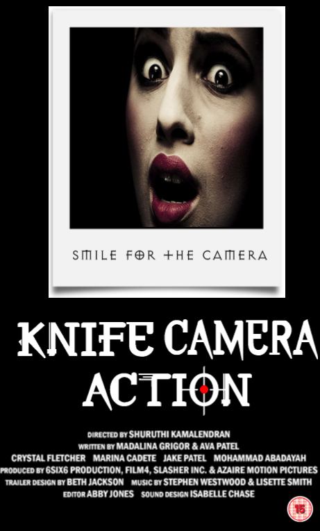
The second template was also liked by the focus group. They thought placing the tagline on the Polaroid was original. However the main image overall was seen to be less enticing and mysterious as the first template due to Polaroids not being modern so the present target demographic thought the image was quite outdated. The positioning of the text was kept the same as the first template as I was unsure how successful the first template would be with its main image.

Overall, I am going to try and stick with using the first template to help me construct my film poster as it appealed to my target demographic
Planning- Rough Print Designs
Rough Design- Magazine Cover

This is my rough design for my front cover of my magazine. The main image is of the final girl looking traumatized, bruised and covered in blood. This is because 'Rue Morgue' is a horror magazine that is known to display gruesome main images to attract their niche audience of horror fanatics. Creating a picture that conveys the brutality and gore of my slasher film could attract audiences that often read 'Rue Morgue' broadening my demographic. Also having the villain in the main image but not identified conveys the mystery and enigma of the narrative intriguing the audience, pushing them to find out more about the film.
The main covers a little of the masthead as this presents the strong brand identity the magazine has, and also displaying their strong audience and fans of the publication. I placed the feature stories on the left as it is conventional place in terms of magazines, although out of all the feature stories the 'knife, camera, action' film title is seen to be the largest drawing more of the focus towards it and the main image. The bar code is also placed on the left, which follows the usual conventions.
I have chosen a colour scheme to portray the slasher genre. After researching about other horror magazine covers, I came across a similarity which was the colour scheme. The colours I saw that was very presistent through different publications of the horror genre was, 'red', 'black' and 'white' these are seen to be dull colours yet the red connotes danger and death, black often demonstrates the enigmatic feature on the cover, complementing shadows and the white is often used on typography or to reinforce the equilibrium. I used the colour black to hide my villains identity as the audience can see the mystery of the image. I decided to also keep the colour of the final girl(victim) quite light, such as baby blue to portray her innocence, and also emphasise her bruises. The typography of the mast head is black with a red background as this suggests murder and danger, and also draws attention straight away to the cover.
Rough Design- Film Poster

I wanted to convey mystery with my slasher poster, through Pam Cooks theory which is one of the institutional mode of address she explains the constant cause and effect till the enigma is solved. With having the killer on the poster but his identity is not revealed shows this 'enigma'. Having a camera as the center image is very symbolic for our particular film since the killer records his death, this also strengthens the films brand identity by using this particular prop and emphasizing the importance. By having a reflection on the camera lens of a female character in distress also conveys the narrative of our film, additionally, because it shows the reflection of the victims face from the lens and it seems as if the killer is watching you with the camera, the semiotic code in terms of Roland Barthes narrative theory is the audience is being placed in the victims shoes. Therefore creating a chilling effect.
The typography is black, and sharp to convey the slasher genre. due the the sharp edges of the font, this portrays the usual weapon that slasher film villains use, which are often sharp (eg a knife). The placement of the title is placed on the bottom to compliment the dramatic image and the tagline is placed at the top to create tension for the audience before looking at the image.
Since I have seen several different slasher film posters as a part of my research, I have obtained that the colour scheme is generally dark, and dull colours, such as as red, black and white to convey the genre. I used very little red, and used black as this conveys mystery, in order to intrigue my audience to watching the film. The credits are placed at the bottom which is conventional as well as the BBFC rating placed on the left hand side.
Planning- Location Recce
Location Recce
As part of our planning we visited potential locations that would feature in our trailer prior to filming. This was done so we could look at any disadvantages within the location, just so if there was we could change the location to somewhere similar instead of wasting time when actually filming and have us face the problems whilst filming. These issues could consist of distance (having trouble traveling with equipment), any disruption to the public, noises (cars, busy areas). Our locations did not have much disadvantages since most of our shots were done in our homes, (the toilet, garage, the garden, bedroom, staircase) however we did consider to film in an alley way but changed it to a path behind a garage of one of our homes since we thought that filming in the evening could be a little dangerous and could alarm passers by, due to the use of our killers weapon during filming.

Subscribe to:
Posts (Atom)