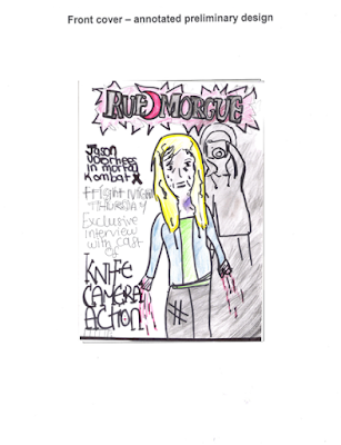
Rough Design- Magazine Cover
This is my rough design for my front cover of my magazine. The main image is of the final girl looking traumatized, bruised and covered in blood. This is because 'Rue Morgue' is a horror magazine that is known to display gruesome main images to attract their niche audience of horror fanatics. Creating a picture that conveys the brutality and gore of my slasher film could attract audiences that often read 'Rue Morgue' broadening my demographic. Also having the villain in the main image but not identified conveys the mystery and enigma of the narrative intriguing the audience, pushing them to find out more about the film.
The main covers a little of the masthead as this presents the strong brand identity the magazine has, and also displaying their strong audience and fans of the publication. I placed the feature stories on the left as it is conventional place in terms of magazines, although out of all the feature stories the 'knife, camera, action' film title is seen to be the largest drawing more of the focus towards it and the main image. The bar code is also placed on the left, which follows the usual conventions.
I have chosen a colour scheme to portray the slasher genre. After researching about other horror magazine covers, I came across a similarity which was the colour scheme. The colours I saw that was very presistent through different publications of the horror genre was, 'red', 'black' and 'white' these are seen to be dull colours yet the red connotes danger and death, black often demonstrates the enigmatic feature on the cover, complementing shadows and the white is often used on typography or to reinforce the equilibrium. I used the colour black to hide my villains identity as the audience can see the mystery of the image. I decided to also keep the colour of the final girl(victim) quite light, such as baby blue to portray her innocence, and also emphasise her bruises. The typography of the mast head is black with a red background as this suggests murder and danger, and also draws attention straight away to the cover.
Rough Design- Film Poster
I wanted to convey mystery with my slasher poster, through Pam Cooks theory which is one of the institutional mode of address she explains the constant cause and effect till the enigma is solved. With having the killer on the poster but his identity is not revealed shows this 'enigma'. Having a camera as the center image is very symbolic for our particular film since the killer records his death, this also strengthens the films brand identity by using this particular prop and emphasizing the importance. By having a reflection on the camera lens of a female character in distress also conveys the narrative of our film, additionally, because it shows the reflection of the victims face from the lens and it seems as if the killer is watching you with the camera, the semiotic code in terms of Roland Barthes narrative theory is the audience is being placed in the victims shoes. Therefore creating a chilling effect.
The typography is black, and sharp to convey the slasher genre. due the the sharp edges of the font, this portrays the usual weapon that slasher film villains use, which are often sharp (eg a knife). The placement of the title is placed on the bottom to compliment the dramatic image and the tagline is placed at the top to create tension for the audience before looking at the image.
Since I have seen several different slasher film posters as a part of my research, I have obtained that the colour scheme is generally dark, and dull colours, such as as red, black and white to convey the genre. I used very little red, and used black as this conveys mystery, in order to intrigue my audience to watching the film. The credits are placed at the bottom which is conventional as well as the BBFC rating placed on the left hand side.


No comments:
Post a Comment