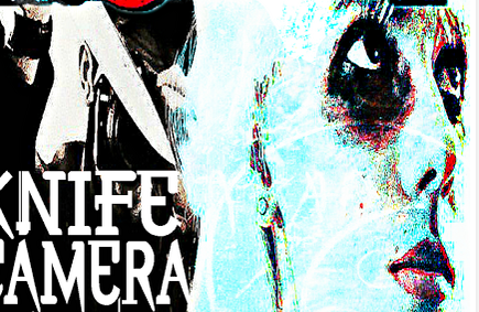
 The trailer often the one that gives away more narrative than the other two texts as it presents the characters clearly yet not giving so much away still creating some sort of mystery. Though the film poster primarily advertises the overall film as a whole. Intriguing the audience, like the trailer it is a way to promote your film. In order to link with the trailer we used the same characters that is seen in the trailer as my main image to present a sense of iconography. My poster consisted of the final girl face as a reflection. I chose the final girl to feature on my poster since
 in the trailer she has a lot of screen time in our trailer in comparison to the other characters. I thought as an important character out of our cast it was an ideal choice for her to also model for my poster, as well as this she is the easiest character to distinguish.
 The villain is also featured on my poster however in our trailer his identity is not revealed, there are no close ups, or shots where we see the killers face unlike our final girl. Although we have cutaway shots to establish his hands, the back of his head, and particular props that help the audience identify the killer whenever he is in the shot. The props that are ofte
n seen in the trailer is also used on the poster to convey narrative. For my poster I featured the hands of the killer holding a camera. The camera in our trailer was overall a prime focus as stated in the synopsis the villain in our film records the brutal death of his victims and some sort of sick hobby. Therefore I displayed a camera, which was a usual DSLR that was also featured in our trailer (and on the centre of my film poster). This prop was very significant as to how killer would hide his identity behind his camera, also throughout our trailer there are points where the audience are witnessing his perspective, which forces them to be in a twisted position, to show that some points are seen in the killers perspective we edited on a record button, a night vision effect, and also manipulated the quality of our footage so it could be assumed to be from a different camera that our villain is using. Therefore using this very symbolic prop reinforces the brand identity of the film as the audience can have a sense of familiarity when watching the trailer and looking at the poster.

 For the trailer we used a particular typography that fuzzed on the screen, the typography was bold and white, with sharp edges to convey its genre as being Slasher. There were focus lines in the middle of the ‘O’ to reinforce the camera prop that is very symbolic to our film, and there’s a placement of a little red dot in the middle of the ‘O’, to support how we used the red dot for the record button whenever the audience witnessed the killers point of view. For my poster I used the exact same typography, in the exact same colour also including the red dot as this also increases brand identity.
However creating this combination was different when constructing the magazine as we did not have complete ownership over this text. The magazine differs since there is no control with what they publish about your film. As Karl Marx suggests “power resides with those who have ownership and control of the means of production and distribution”. Magazines are distributed through vertical integration, which means the publication is owned by larger companies that have control over the production, distribution, and exhibition therefore furthermost of the profits go to directly to the larger company.


Synergy is used when one platform promotes another, since ‘Rue Morgue’ is featuring and displaying an exclusive interview of ‘Knife, camera, action’ demonstrates the synergy between the two platforms and vice versa as in the trailer of ‘Knife, camera, action’ displays a rating from the magazine to feature their brand.
 Although we decided as a group to keep the title of our film that is on the front cover of the magazine, in the same bold white typography we have on the poster and trailer just to help highlight the brand of our film despite being on a different publication. However other feature stories that were presented were in different other typography and other colours.
Yet unlike my poster which conveyed enigma, my magazine cover portrays more of the Slasher genre as it incorporates the knife which is the key weapon in our film and also the camera which is symbolic as I’ve said before. You can see more of an outline figure of our villain than the poster as there’s only the hands of the villain displayed, and you establish the face of our final girl as it takes up half the magazine page whereas the poster you only see her faint reflection. The magazine often displays less of an enigmatic main image and an image that is rather more entertaining/gripping, as magazines often sells the insights of the film. As consumers, audiences obtain the media for three reasons which is for entertainment, information and social interactions, identifying what ‘Rue Morgue’ expresses to their specific target audience (which is horror in entertainment and culture) it helped with what sort of image needed to be used. To reach out to the general audience of ‘Rue Morgue’ I thought it was necessary to make the Slasher genre more apparent on the magazine cover as the magazine is aimed at a niche audience of horror enthusiasts therefore it could appeal to some of the audience of ‘Rue Morgue’.
The chosen magazine I featured my film in was ‘Rue Morgue’, this magazine particularly had a certain way of displaying their main image. Most front covers from ‘Rue Morgue’ are very much illustrated as well as brightly coloured (eg. Bright red, orange, green) despite being a horror publication. Knowing this knowledge and researching about other magazine covers that ‘Rue Morgue’ have produced I decided to use a colour scheme that was seen to be brightly coloured compared to my poster, just to present that I do not have ownership over the magazine. The colour scheme that ran through my publication was light blue, black, white and red. These colours help stick to the slasher genre and the brand identity of my film, such as the black, red and white however adding the hint of light blue highlights the identity of the magazine and their lively front covers. The main image has the villain in black and white and the final girl filtered in light blue to show the contrast between these two characters and imply the binary opposites, of good vs evil, I chose blue to also portray her innocence and the black and white of the villain to create a mystery of the identity of the killer as his face is covered by the camera he is holding. I also altered the image to seem as if it is illustrated to also fit with the conventions of ‘Rue Morgue’ as most their covers are very much illustrated.
In order for my distribution campaign to be successful, combining both magazine and poster, with the trailer helps promote my independent Slasher film. Not combining both magazine and poster with my trailer would not help promote my film as these separate text present different aspects of a successful campaign. For example the trailer presents more of the narrative and there is a glimpse of different characters, whereas the magazine cover and the poster cover consist of just two main characters. The poster presents a lot of enigma, whereas the magazine displays some narrative. Without each other, I don’t think my distribution campaign could be successful.
 Most films usually promote through the uses of cross media convergence as larger companies own other platforms of media for example 21st century fox is an American multinational mass media corporation as it owns 20th century fox which is an American film distributor, 21st century fox also owns fox music that could produce a sound track to the film made by the distributing company of 21st century fox. However because my film is a British independent film, it needs to find other, efficient ways to be promoted. Such as the use of internet marketing. As digital technology is becoming advanced, there are more uses for Web 2.0 than ever before. As consumers receive information at an instant, it is easier to create a buzz and promote a low budgeted film. Independent, or not, a film tends to have their own website, as this tool would help get the word around about their film. Also using different social media for internet advising would help reach our target demographic also through Web 2.0 exchange is easier to achieve as reviews are written on IMDb and Rotten Tomatoes as well as sharing over Facebook, twitter etc opinions of the film, also parodies done and uploaded by YouTube. There are even some YouTube stars that review films, YouTube stars often have quite a large audience, for a low budget film to get the recognition of a YouTube star can also help promote the film. If a buzz over the internet is then created then the film could potentially have an enormous profit and could even turn into a cult film with its own merchandise. Festivals are also ways in which could increase popularity efficiently, if a film wins an awards or generate critical acclaim, this is positive publicity for the film increasing its chances of gaining more profits despite being low budgeted or not.
Overall combining the two ancillary texts and the main product would help with my distribution campaign.
No comments:
Post a Comment